Crafting a visually attractive UI design is crucial for any designer who wants to produce a website that stands out and captures the user’s attention. as a UI designer it is paramount that for designer you put out there, they are unique while being easy to use and captivate the user’s attention.
This article will explore best industry methods to make your design visually appealing.
Research on how to Use/combine/Mix colours neatly:
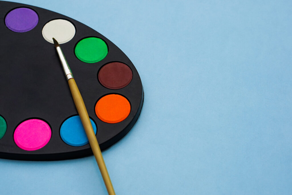
Colours can evoke various emotions in users, so it is essential to select colours that correspond with the message you wish to convey. Using complementary colours can also contribute to an aesthetically appealing design.
Conducting thorough study on how to properly use, blend, and mix colors is critical to catching and sustaining user attention when it comes to UI design. Colors are important in generating emotions, building brand identification, and improving overall user experience. As a designer, you can develop harmonic and visually appealing interfaces that resonate with the intended audience by understanding color theory. Color can lead users’ attention, highlight significant features, and provide a sense of hierarchy within a design. Choosing a consistent color palette keeping elements like contrast, saturation, and accessibility in mind ensures that the interface is aesthetically beautiful and accessible to all users. You may create a visually appealing experience that keeps users interested by combining well-researched color choices into UI designs. Some free online color tools, pickers and palette generators that will help create amazing user experience are Coolors, AdobeColor CC, Image Color Picker, and Site Palette (chrome extension) to mention a few.
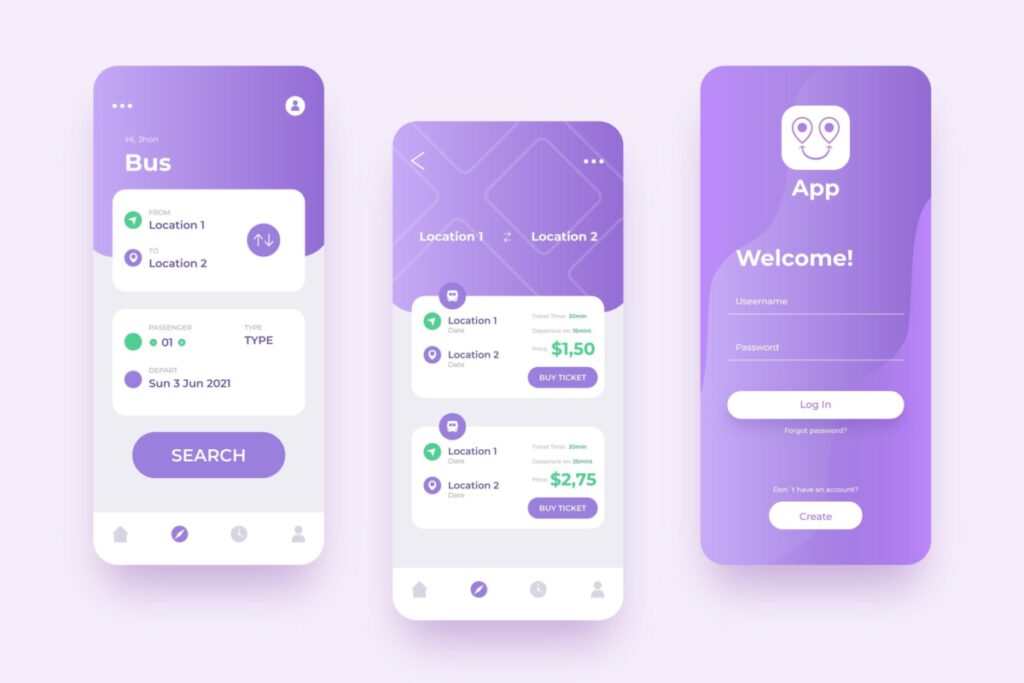
Using high-quality images:
High-quality images can add value to your design and make it more visually enticing. To prevent confusion and maintain coherence, it is essential you use images that are pertinent to the text.
Images have a wonderful capacity to transmit messages, elicit emotions, and provide consumers with an engaging visual experience. As a designer, you can improve the overall aesthetic appeal and believability of a website by using high-resolution, professionally taken photographs into the design. These images serve as significant visual cues, drawing users’ attention and efficiently communicating the core of the brand or the purpose of the material. High-quality images also help to ensure a consistent user experience by reducing loading times and ensuring crispness and clarity across multiple devices. Whether it’s presenting products, explaining concepts, or creating a specific atmosphere, incorporating high-quality photos into UI designs increases overall impact and delivers an immersive experience to your users. You can get high quality images on Freepik and Vecteezy.
Select typography deliberately and with care:
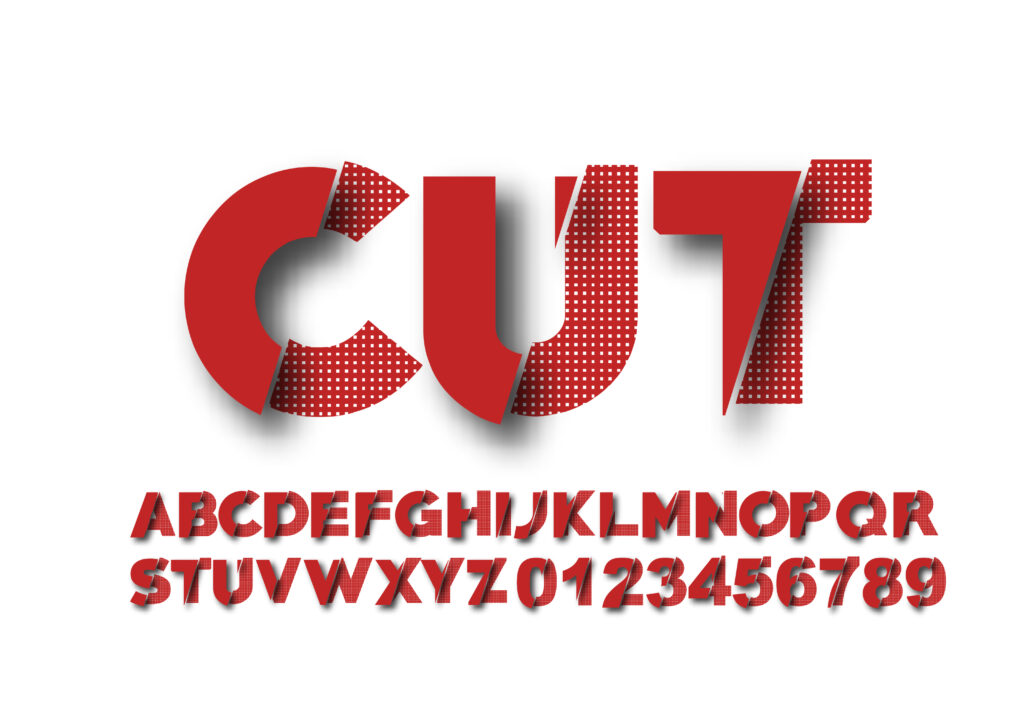
Typography is an essential design element that can make or ruin a design. Choosing the appropriate typeface and size can enhance the readability and aesthetic appeal of a design.
Selecting typography intentionally and with care is a critical aspect in grabbing and sustaining user attention in the world of UI design. Typography is a powerful visual element that effects the overall user experience and expresses the interface’s tone and personality. Fonts that are carefully picked in terms of style, size, and spacing improve readability, legibility, and hierarchy within the design. Designers may build a unified and visually appealing interface by using typography that is consistent with the brand’s identity and supports the overall design aesthetic. Furthermore, well-designed typography may direct readers’ attention, emphasize vital information, and improve overall visual hierarchy, making the text readily scannable and consumable. A careful study of typography not only improves the aesthetics but also promotes a unified look. Here are here are a couple of websites you can find free Fonts to improve your typography, Adobe fonts and Open Foundry.
Visual hierarchy
This refers to the arrangement of elements on a page in order to direct the user’s attention. It is essential to use various font sizes, colors, and spacing to create a hierarchy that directs the user’s attention to the most crucial information.
Establishing a strong visual hierarchy is critical in UI design for grabbing and directing user attention. The arrangement and prioritizing of items within a design to guide your users’ focus and assist them navigate the interface fluidly is referred to as visual hierarchy. You can construct a clear and intuitive hierarchy that takes users through the content in a logical and engaging manner by intentionally managing aspects such as size, color, contrast, and location. Visual signals emphasize key information and vital aspects, while secondary or less important elements are appropriately suppressed. This intentional arrangement not only improves the design’s aesthetics but also the overall user experience by lowering cognitive load and allowing people to rapidly grasp the structure and relevance of the design.
In conclusion, the key to creating a cohesive design is using a consistent design. Using consistent colors, typography, and layout will aid in creating a visually pleasing design.
(Image by Freepik)