
Each product team needs a skilled UX designer, as they serve as the link between users and the business, listening to the feedback from users, reconciling it with business goals, and then designing it into features. Throughout the design process, UX designers are required, both for research in the early phases and for testing work in the final stages. But as they create products which are aimed at meeting user’s needs. There are things UX Designers often forget to design. Some designers often overlook these aspects of design and assume it as not so important to users.
Users are at the center of UX design, by empathizing with the user, you can identify their pain points and assist them in solving them. The UX field is so broad and it is only normal for designers to overlook the seemingly insignificant details when designing. From user research to prototyping to implementation.
We have taken our time to put together some of the most common things UX designers often forget to design.

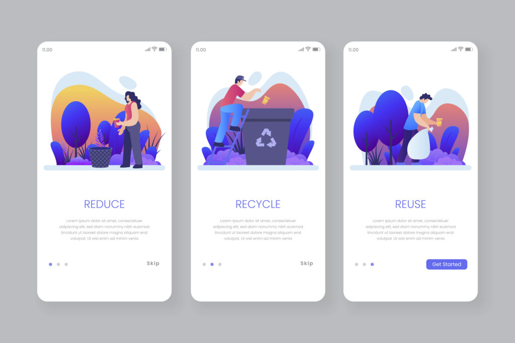
Onboarding Screens
One of the things UX designers often forget to design is the product app’s onboarding screens. An app’s onboarding screens are the first introductory screens that appears when you open the app.
The onboarding screens are series of screens that will help to guide your users through the app’s interface and important functions.
It’s meant to give you a brief overview of your app. Therefore, having well designed onboarding screens which will display the key information about your product will give your user a welcome feeling and save them from getting confused on the app’s functionalities.
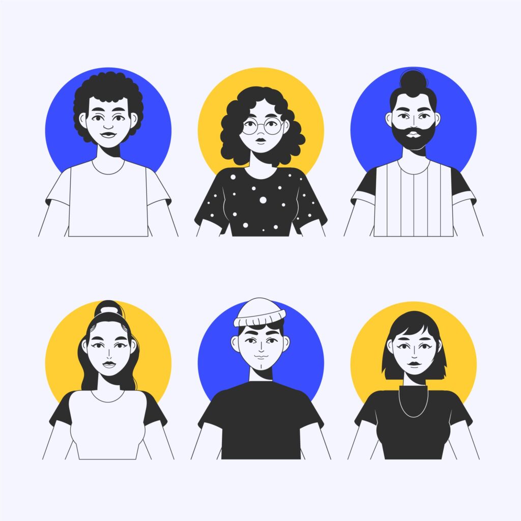
The Default User Avatar
Also known as a profile image, the default users avatar is one of the things UX designers often forget to design. Some designers often overlook these aspects of design and assume it as not so important to users. For every new user to an app or website, default user avatar or pictures are displayed before they upload their personalized photos. We have seen users who would prefer to remain anonymous, designing really beautiful default user avatars that can show the brand off is not only a great plus for the overall user experience but an additional plus for the brand image.
Empty State
When a user enters an empty field on your app or website, their screen shows an empty state. For example, inputting a search query that has no results, this page is referred to as an empty state on your app or web page. A good UX will be to design this page with an illustration to pass the message across and to also add a call to action button that will direct them somewhere more helpful. This will make the user experience seamless.
The Navigation Buttons
Designing the page footer buttons for screens that have many pages is a great way to improve user experience but this is also one of the things UX Designers often forget to design. Some designers often overlook these aspects of design and assume it as not so important to users. And other designers often forget to design this part. These buttons will help your user to easily jump to whichever page they want to see on the product and the absence of these buttons can make navigation less easier which may lead to a loss of interest from your user.
The Splash screen
An app’s splash screen is the first screen when it is opened for the first time and displays the brand logo or an animation of it. Screens could be static or interactive with animation and progress bars. Users will be less frustrated by a nice splash screen.
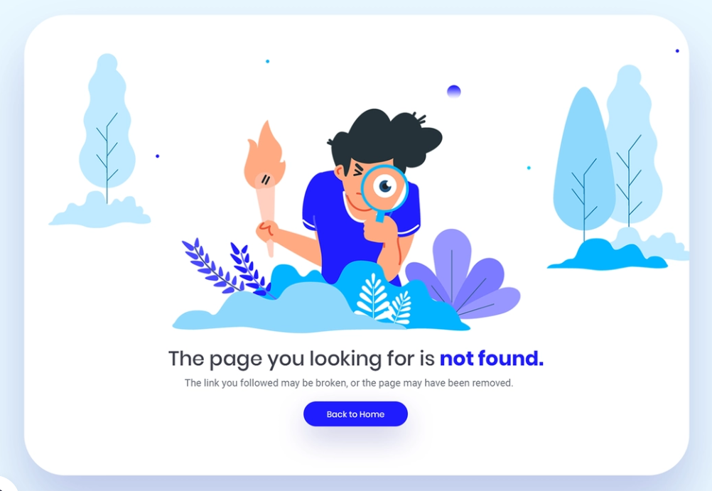
404 error page
When a user attempts to access a site that does not exist or when they use the wrong URL, they land on a 404-error page. 404 error pages that are well designed will lower the bounce rate, since users won’t just leave the page frustrated when they reach a dead-end.
Skeleton Loader
It may take some time for your app to fully load when it is heavy with content, so it is very important that frames are loaded, since frames are responsible for encasing content once fully loaded. This will improve the overall user experience. UX designers often overlook this point when designing apps.
The App Footer
In many cases, designers forget the importance of footers, which show the end of each page within an app. The footers of applications let users know when they have reached the end of a page, rather than having to scroll endlessly which may frustrate them.
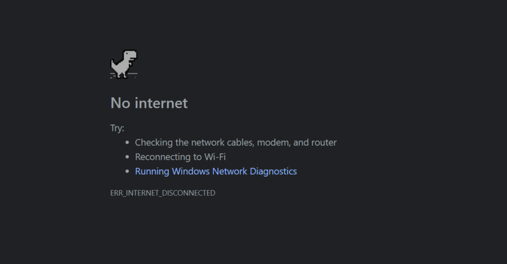
No internet state
Sometimes the internet services of your users may be down and your app or webpage will not load at such times. designing a “no internet” page that is engaging will greatly help your overall user experience and this is one of the things UX designers often forget to design. An example of a very good “no internet” page is Google Chrome’s no internet page. Chrome has added a Dragon game feature to keep users engaged while waiting for their internet service to be restored.
System Notifications
Don’t leave users wondering. Users should be notified of successful or unsuccessful task completions on your app or webpage. These notifications can aid your user’s journey to be seamless, it can help them undo some of the tasks they must have mistakenly carried out or changed their minds on after carrying them out.
==================
These may be seemingly small details, but these are also what makes your design above average and become world class. Good UX has to be thorough.
Things UX Designers often forget to design,