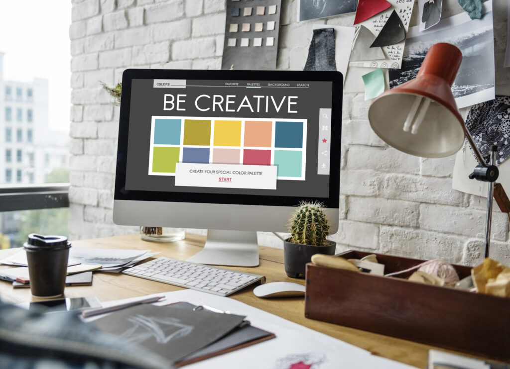
One of the essential factors constantly driving choices of color in UX design is its psychological impact on the user. While some people might think a color choice or role of color in UX design to be an embellishment of sorts, something to make design beautiful and eye-catching, every single color in UX design has a specific mood and niche in the color palette in general.
A carefully and well-thought- out color palette can have a great positive effect on your design. This shows how colors play a great role in UX design. It can move a design from an average design to an excellent one. Whereas a mediocre color palette can impact and detract from a user’s overall experience and even interfere with their willingness to use a website or app.
While most UX designers will just think of how to make the page appear beautiful, a skilled UX designer understands that color theory is much more layered than that. First, they determine the factors that color theory espouses, then, they add colors which might look a bit surprising at the first glance, to great effect. Understanding color psychology on users is a key aspect of creating a color palette that works well in digital design. Like we mentioned, while color in UX design is sometimes thought of as a simple aesthetic choice by some UX designers, it is, as a matter of fact, one of the key components of the psychological impact of a design on users and user experience.
“The craving for color is a natural necessity just as the craving for water and fire. Color is a raw material that is indispensable to life. At every era of his existence and his history, the human being has associated color with his different emotions. his joys, his actions, and his pleasures.”
– Fernand Leger, “On Monumentality and Color”, 1943
Color Psychology
Color in UX design can not be discussed without discussing the psychology of color. Color psychology speaks on the effects color can have on humans in several ways. Some people might argue that the impact of colors are subjective and personal but there are several traits of color psychology that can be addressed on a general level. The meanings and significant impact of the primary, secondary and tertiary color in UX design are somewhat similar.
The emotional effect of color in UX design is also a very tricky topic to deal with. Even though the emotions evoked by colors like black and white and gray are constant, a simple change in any of those colors can cause a difference in their perception. The use of a significant color in an unorthodox manner that is associated with something else can also create ripples in the minds of the users.
Color and Culture
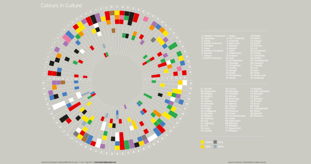
The role of color in UX design cuts across different cultures and regions. You must understand your target audiences and how different colors may affect them or what these colors represent or mean to them. One of the major factors that UX designers have to consider is how different cultures may determine the perception of color in UX design and for different users. For instance, White has multiple implications in multiple and different cultures. In western regions and societies that practice western culture, White is seen to be a symbol of peace, hope and purity. In Asian societies however, White is the color of death, sorrow and mourning.
Very few colors have a consistent emotional effect across borders and regions, and this is where it may get tricky for a UX designer. One of the main things to do is to eliminate the negative connotations implied by a particular color while you are targeting a larger heterogeneous audience. If your target audience is a group of people that has a cultural homogeneity, then there is really no need to bother about selecting colors which are semantically inclusive.
It’s very essential and important that UX designers look at the cultural implications of their color palettes based on the target audience. If the product being designed is going to target a worldwide audience, it is then important to balance the colors and imagery being used in order to prevent negative cultural connotations. If the product will be primarily targeting only a particular group of people with a distinct culture, It is okay then for UX designers to pay less attention to the implications the chosen color palette may have in other cultures.
Colors and The Brand
The role of color in UX design comes fully into play when it comes to brand values. The brand values have a major role to play in creating a color palette but the brand is not just the only factor to consider. The brand Industry norms are also key, are the colors already being used by competitors? Your color in UX design needs to be unique, this means that it is important that your colors do not resemble the colors already being used by a close competitor of your brand.
Using a color palette and scheme that is identical to a brand’s major competitors is a great way to breed confusion and ensure your brand does not stand out.
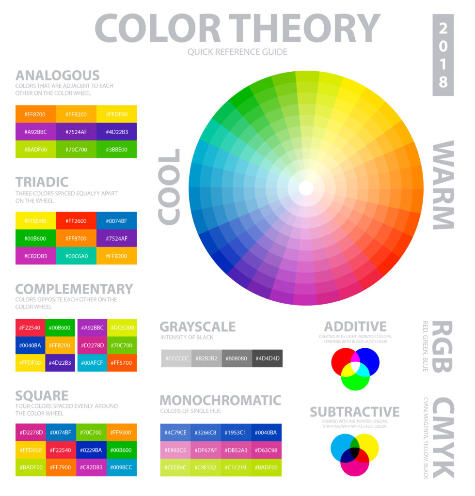
The first step towards creating a color in UX design which supports the brand’s values and stands out amongst competitors is to understand the various colors, their meanings, and how tweaking their display by making them lighter/brighter/darker/duller/etc. can affect how they are perceived.

Let’s take a look at a basic outline of what different color in UX design mean:
- Red — Red represents danger and passion, but also represents excitement. It’s a very strong color which can elicit strong reactions in several people. Lightening it to give a sort of pinkish look makes it more feminine and romantic while darkening the color to maroon makes it more subdued and traditional.
- Orange — Orange color is a very creative vibrant color that can be associated with adventure and youth. It is energetic too. Orange can also evoke a retro feeling because of its strong ties to 70s style.
- Yellow — Yellow is optimistic, happy and cheerful. It is mostly popular in designs for children. More pastel hues are often added to represent a gender-neutral baby color, brighter yellows are used in creative designs while darker shades of yellow make gold, which is associated with sophistication and wealth.
- Green — Green can be associated in different ways. On one hand, it is associated with feelings of wealth and tradition (especially the darker hues), while on the other it is strongly associated with life, nature and environmentalism. Lime greens are sometimes associated with growth and renewal.
- Blue — Blue is often associated with trust and loyalty. Brighter blues can be associated with communication, while duller blues can be associated with sadness. Blue is the most universally liked color, which kind of explains why lots of companies opt for blue shades for their branding.
- Purple — Purple is another color in UX design that has varied meanings. It’s long been associated with exclusivity and royalty( purple dye was rare in many ancient civilizations and was reserved exclusively for royalty). Purple is also associated with spirituality and a little mystery. It can also be associated with creativity.
- Black — Black denotes sophistication and luxury. It can also be tied to sadness and sorrow, however, depending on the other colors used with black, it can sometimes feel modern or traditional, formal or casual.
- White — White is associated with purity, positivity and innocence. White is also commonly used in minimalist designs because of its neutrality and simplicity. And just like black, white can take on the characteristics of other colors it’s used with.
- Gray — Gray has different meanings, depending on the context. It may be associated with conservative and sophistication and dull. It can be also be associated with emotionless or moody. And also with sorrow and sadness.
- Brown — Brown is associated with being humble, down to earth and grounded. It’s also associated with coziness and natural. And, of course, it can be associated with being dirty or dingy.
Being aware and understanding the basic color in UX and it’s meanings gives UX designers a solid basis on which to build color palettes that meet user expectations for any brand or product.