Design systems are incredible untapped resources which are very useful in your design journey. Design systems tremendously help UX designers in developing and creating better user experiences and interfaces just by the study of design systems! It is important that as a growing designer, you adopt and implement design systems into your workflow. What better way to fully understand how to create an e-commerce design flow than from Shopify or to design an iOS mobile app than from Apple?! These can be known as Design Patterns and successful and skilled UX designers know how to use these patterns and design systems to inform and impact the decisions they make with their own product designs.
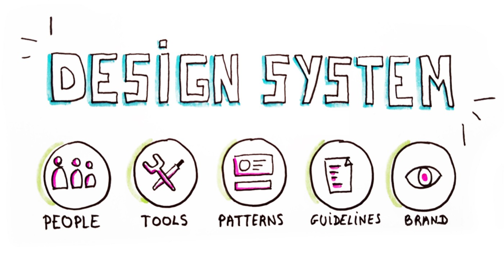
What are Design Systems?
Let’s start by saying what Design Systems isn’t: design systems is not a sort of Sketch library, nor a Style Guide or some type of Pattern Library. As a matter of fact, it’s all of this combined and even more!
Design systems are a combination and collection of several design documents, important design articles, design examples, code snippets, screenshots of great designs, UX guidelines and principles, design components, philosophies and lots of other digital assets for a product design company. Design systems are often hosted online as a website (external or internal). You may think of it as a big library of design kits, instructions, language and coding guidelines all wrapped up.
A design system gets created and developed in collaboration with an entire product team which is made up of programmers, engineers, testers, UX designers, product managers, etc. Ideally, the whole team comes together as a committee to work on the design systems. They take inventory of all the company’s existing digital products, assets and all its elements (websites, apps, logos, color patterns, headers, footers, forms, code etc) and attempt to come up with a decision about how things needs to be designed, coded, developed, viewed by the public, used by the target users and even talked about.
It’s the team’s master collection of knowledge and plans, the source of all truth and a reference to ensure that everyone, both new and existing members who will work on the company’s product is always aligned, consistent and in pattern with the way things have been set.
In this article, we are going to look at some great design systems and how you can utilize them as a study guide to understanding UX and product design practices and implementations.
Let’s dive right in:
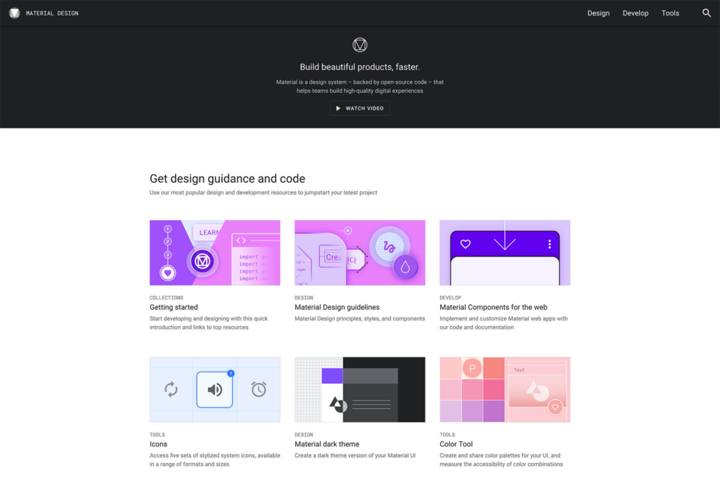
Google Material Design System
The Google material design system was introduced in 2014 and has since then inspired many other companies and teams to adopt their own design systems. The Google design system is created to imitate the real world, this means that components are created to imitate the physical world and its components like how objects reflect light and cast shadows. The idea behind this creation is that when elements behave like real-world objects, they tend to become more familiar and very much predictable, which in turn reduces cognitive load for users.
The Google Material Design is wide and covers a comprehensive number of topics. Topics ranging from UX design principles like Layout, Color, Typography, Components, Material, Theming, Design Source Files, Mobile Guidelines, Starter Kits, etc – most of which are readily available as open source – to allow for code documentation and other resources.
The Material design system allows for downloads of UX design component source files even for the most popular software (like Figma and Sketch). Therefore it is available to designers who wish to add the design system to their collections and learn from the Google design system. You can also find Material studies that demonstrate how thelming and components can be used to create beautiful, usable apps which meet your user expectations.
Apple Human Interface Guidelines
The Apple Human Interface Guidelines is a design system created for designers who create, develop, and distribute apps through Apple’s channels (macOS, iOS, watchOS, and tvOS). Apple’s Human Interface Guidelines is not just one of your random design systems. It is an incredible resource full of downloadable guidelines, components and templates which product designers and developers you can use in their own projects. With Apple’s design system, there is so much for you to learn, admire and copy from their style guide. For example, there are the SF icons which you can download and use to complement the system font for Apple’s devices.
Under each of the design system platforms, you can find resources and guidance on menus, app architecture, touch bar, themes, buttons, user interaction, extensions, fields and labels, visual index, selectors, indicators, system capabilities, icons and images, visual design, window and view, and more. Each of the sections offer clear and in-depth guidance on the intended use of each of the elements and the rationale behind it. The ultimate goal for Apple is to ensure that apps distributed to Apple’s platforms look and feel familiar and consistent to people who use them.
There is also an added library with extensive resources on Sketch, Photoshop, and Adobe XD files, which contains a range of UX/UI elements and their specifications. You may also choose to watch video sessions, guidelines and tutorials on how to build intuitive and user-friendly experiences.
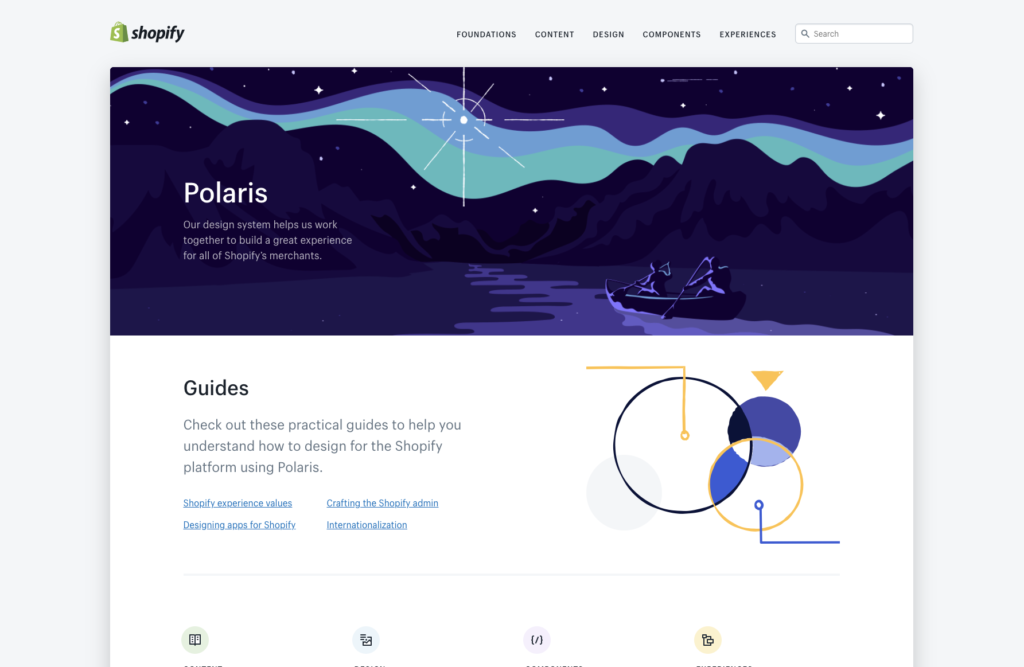
Shopify Design System
Shopify is an e-commerce platform that has all you need to start, run, and grow a business online. It powers millions of businesses all over the world.
The Shopify Polaris is one of the top 5 design systems for UX designers. It was developed to allow all Shopify merchants to enjoy a great user experience and benefit from a beautiful store design. The Shopify Polaris design system has resources and guidelines for the crafting of every part of the Shopify experience; The system features components like Colors, Accessibility, Resources, Typography, Illustrations, Sounds, Icons, Interaction states, Spacing, Data visualizations. It also includes guidelines and contents from admin screens down to product experience and various apps for Shopify. You will also find some useful links to third-party software and tools that can serve as an added guide, inspiration or simply help you learn how to effectively design for Shopify.
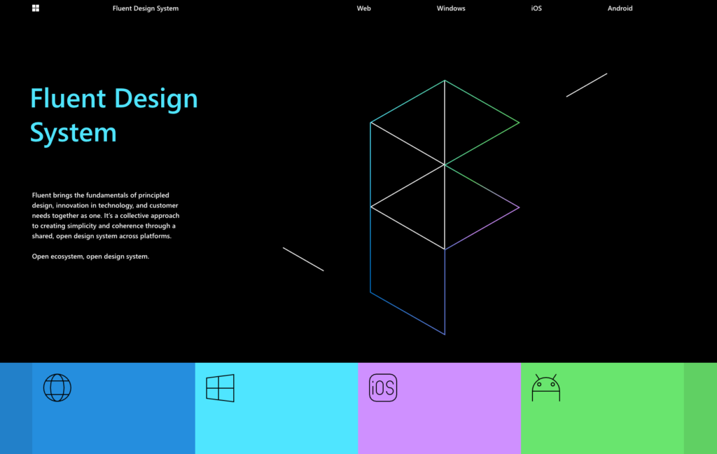
MS Fluent
The Microsoft Fluent Design system was created in 2017. A collection of UX frameworks and UI components that possess a set of interaction behavior, shared code, and has a unified design approach. The MS design system helps build coherent and consistent experiences across several platforms, including web, Android, Windows, and iOS.
Fluent highlights five important elements – light, depth, motion, material, and scale – using the physical world as its vocabulary, the creators believe that exclusion is bound to happen when designers try to solve user problems using personal biases. They seek out those biases and exclusions, and use them as opportunities to create new ideas and inclusive designs.
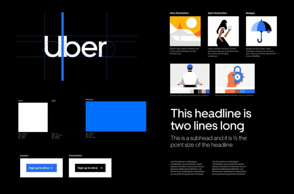
Uber
Uber’s design system houses important features such as: Logo, Brand Architecture, Color
Composition, Iconography, Illustration, Motion, Photography, Tone of voice, Typography.
Uber is a company that takes pride in their system’s flexibility and ease-of-use, and consistently in maintaining brand goals across various sub-brands, applications and assets.
In addition to their visual and style guidelines which are all part of the design systems. Uber also created Base Web, an open-source file which houses components that focus on the basics of design elements, such as color, typography, grid, and iconography, as well as some really essential elements such as buttons, lists, and controls. While these components are designed as basic building blocks, they’re also highly and easily customizable through style overrides and can be configured in many other ways.
==================
Other Design Systems include:
=========================