What often leads to UI design mistakes among junior designers, in general, is a lack of design knowledge. Design trends are temporal and they’ll be new ones every year.
A common UI design mistake junior designers make is ignoring the fact that even the most aesthetically pleasing designs fail if it does not prioritize the users’ experience and accessibility.
Design trends are temporal and there’ll be new ones every year. However, having solid design knowledge allows you design user-centric products that are as visually appealing as they are useful to your target audience, even as trends change.
Let’s look at a few of these UI design mistakes junior designers make and how to avoid them.
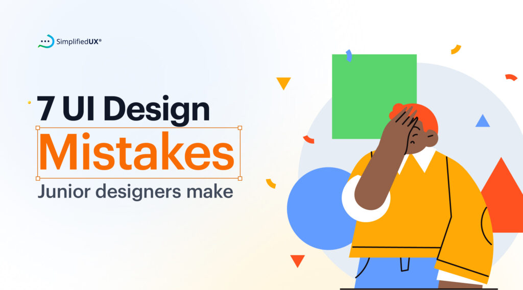
Common UI Design Mistakes and How to Avoid Them
1. Scaling
This usually happens when junior designers ignore design systems to do something of their own. While it’s true that not all design systems produce usable designs, you can’t help but notice that when junior designers design without a guide, zooming to 100% on Figma leaves the font size, buttons or shapes looking disproportional.
Even without a design system, you can prevent elements from looking disproportional with this handy guideline:
- Embrace the 8-point grid system: This common practice ensures consistent spacing between elements.
- Find the button sweet spot: Aim for a button height between 40-48 pixels for optimal usability. Consider 56 pixels if targeting users with larger thumbs.
Don’t forget to always use shift + 0 to ensure that your designs look excellent.
2. Typography errors
There are certain typography errors junior designers make but one that is most common is leaving orphans (leaving single words on a line by itself) and misusing em and en dashes.
To fix this, practice setting type frequently and seek feedback from a mentor or senior designer. You can read more about this on blogs like Smashing Design and practice with the typography design workbooks on SimplifiedUX.
3. Primary and secondary buttons lack clear distinction.
The user journey within a product is often guided by the buttons within the app/website. And often there will be various actions you want the user to take with one or two being a priority.
To ensure users take important actions, visually prioritize primary buttons with bold colors to guide them in the right direction.
4. Too many effects in one design
We all love exploring new design effects. However, you shouldn’t try it all in one design. Using too many effects at once can make your design feel cluttered.
Try using one effect at a time, like a gradient background paired with subtle text shadows.
5. Information overload
It’s easy for users to miss the message you want to pass across when there is way too much text than is necessary.
Users often get overwhelmed by lengthy paragraphs which leads to website or app abandonment. Use few words to communicate important messages and images/graphics to illustrate the rest.
6. Using Toggle buttons instead of checkboxes
Junior designers often confuse when to use togle buttons and check boxes. Toggles should be used when an action will be applied immediately the button is tapped on. Example night and dark mode toggle button, otherwise, use checkboxes. Also, use checkboxes if there are multiple options and the action will be applied together.
Bonus point to prioritize accessibility. Add a tick icon along with the green color in the toggle for the ‘on’ state. This way you’ve helped users with color limitations or color blindness identify which state is on/off.
7. Lengthy forms
When designing lengthy forms users will get overwhelmed if you put out all the fields and information at once.
To fix this, use progressive disclosure technique to break the form into steps and show the user where they are in the process.
Conclusion
It is fine to not have everything figured out in the early stages of your career. Even senior designers continuously refine their skills to stay ahead. The good news is, focusing on building a strong foundation will minimize how often you make design mistakes. Keep these tips in mind, keep practicing, and you’ll be designing User Interfaces that users love in no time.