Making responsive UI designs in Figma is often the first thing that comes to mind when designers are asked to make designs responsive. Figma indeed offers robust features for designing and prototyping responsive layouts, however, other design software like Framer, Adobe XD, Sketch, InVision Studio, and Webflow provide its own set of features and capabilities for designing responsive layouts. The responsive design approach can also be implemented through coding languages like CSS, HTML, and Javascript.
We will discuss the elements or principles of a responsive design in this blog post. An understanding of these principles will equip you to design responsive layouts across any design software whether you’re a seasoned designer or just getting started.
What is responsive design?
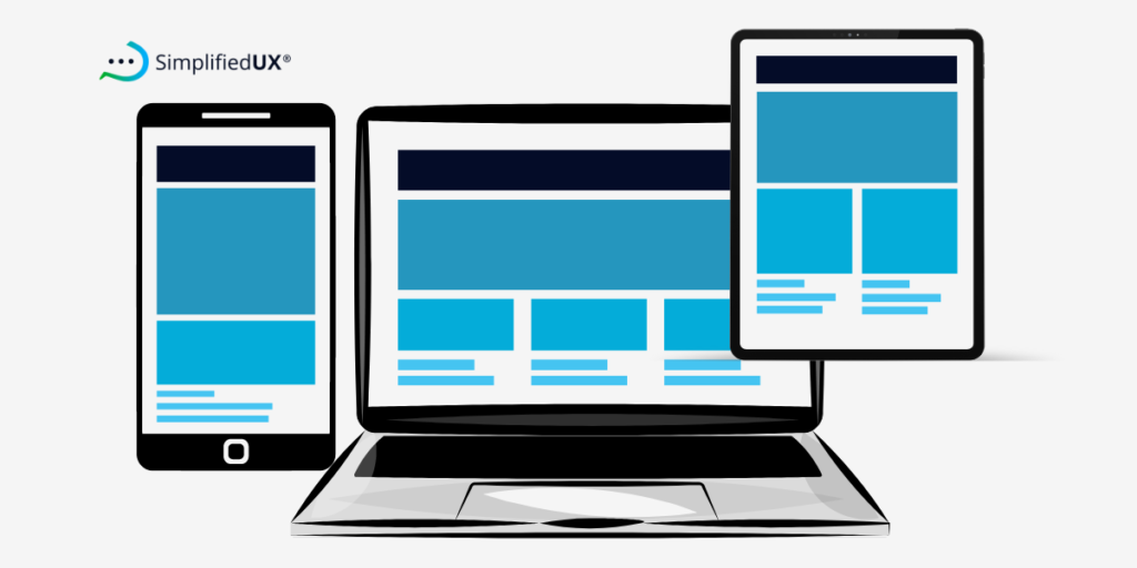
Responsive designs can adapt to various screen sizes without elements like text, images, layout, etc looking out of place.
Responsive design is a product design approach that takes into consideration the layout and functionality of a design to adapt and fit the screen size and device they’re being viewed on.
This ensures a seamless user experience for everyone, regardless of whether they’re accessing the website from a desktop computer, tablet, or mobile phone.
What makes a design responsive?
There are key characteristics that define a responsive design. They include:
- Flexibility
For a design to be considered responsive in Figma or any other software or device, the layout should be able to resize and reposition itself automatically to the screen size it is viewed on, This prevents elements from breaking or overflowing and maintains a visually balanced composition across various screen sizes.
- Usability
Responsive UI designs put into consideration navigation menus as well. With this, users can move about the product (app or website) to take specific required actions. Buttons and other interactive elements are optimized for touchscreens on smaller devices so they are easily used. On mobile, for example, buttons can adapt to become larger and easier to tap, while drop-down menus could transform into hamburger menus for easy access.
- Readability
A responsive design approach ensures text size and spacing are adjusted for comfortable reading on all screen sizes. It also guarantees that fonts chosen are easy to read at small sizes, and line spacing is increased where necessary to improve readability on mobile devices.
- Performance
Device performance is also put into consideration when creating responsive designs in Figma. Images and other media are optimized for faster loading times, especially on devices with slower internet connection speeds.
Image compression and using appropriate file formats can be applied to ensure a smooth user experience.
What are the three main elements of responsive design?
These are the principles that to follow to create responsive UI designs.
- Flexible Grid Systems
A fluid design system defines the “zones” where content can be placed and repositioned to fit various layouts. Column sizes can condense or expand depending on the device in use to ensure elements are not distorted in appearance after resizing.
- Fluid Images and Media
You will notice that the images and videos on your mobile and desktop do not have the same proportions. For this reason, they have to be designed to fit the specific sizes of various screens.
This prevents them from breaking the layout on smaller screens and ensures a clean and uncluttered viewing experience for users. Using SVGs (Scalable Vector Graphics) and image resizing tools can help to achieve this.
- Media Queries
Media queries dictate how the website’s appearance changes based on specific screen size conditions. It works by using breakpoints, which are like specific cut-off points. If the screen size falls below a certain breakpoint, the browser knows to adjust the layout to fit everything comfortably.
Why is it important to make designs responsive?
Managing multiple site versions for different devices is so yesterday. A responsive UI design allows you to manage a single website that seamlessly adapts to any screen size, from desktops to mobile. This guarantees a consistent and seamless user experience across all platforms while saving you time and resources.
A seamless user experience reduces the bounce rate on your website and increases user engagement with your product and satisfaction.
How to Create Responsive UI Designs
Creating responsive UI design rests heavily on the principle of flexibility. This means creating user interfaces that can adapt and adjust their layout based on the screen size of the device. Ensure to always design buttons and interactive elements suitable for touch screens for touchscreens. Keep users with large thumbs in mind, and navigation menus should be designed to fit limited screen space as well.

Responsive Design vs Adaptive Design
Adaptive design uses predefined layouts. Multiple website layouts designed for various screen sizes are created. The server then detects the user’s device and delivers the most suitable layout.
In case you would like to use the adaptive approach in your WordPress design, you can design an adaptive UI in WordPress using the wiziapp plugin.
A response UI design requires only a single website layout. This single layout adapts and adjusts its elements based on the screen size it is viewed on. Then elements like images, text, and menus resize and rearrange themselves to fit the available space.
The good thing about responsive designs is that it doesn’t require a lot of maintenance afterwards, however, it does require a lot of coding to push to production.
Adaptive designs on the other hand require less coding to implement and frequent maintenance & management.
Examples of Responsive UI Design?
Of recent, almost all websites and digital products use the responsive approach for designs for ease of maintenance and I’ll be sharing a few examples of these responsive UI designs.
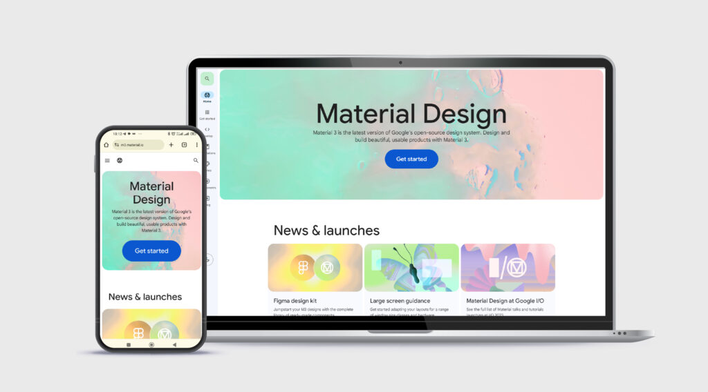
1. The first example is from Google’s material design.
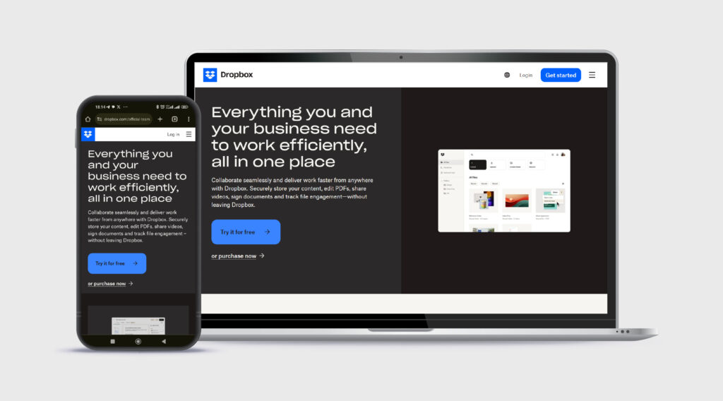
2. Another form Dropbox
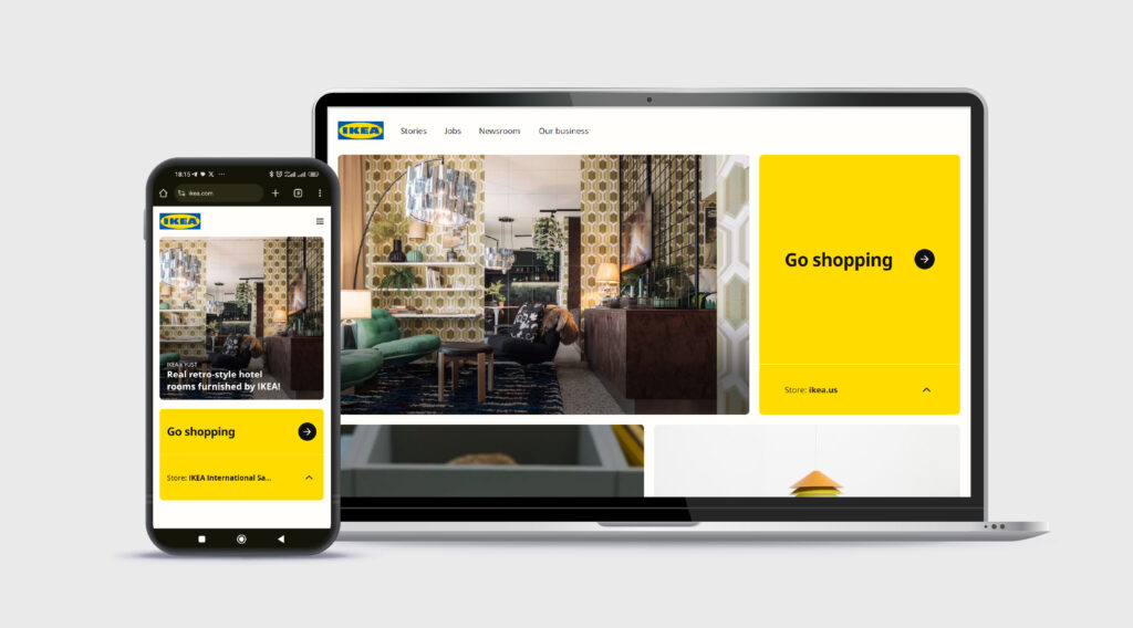
3. An example from IKEA
Responsive Design Best Practices
- Design for mobile first then scale up to desktop.
- Put accessibility first. Always consider button sizes for users with large thumbs.
- Identify and make use of breakpoints.
- Ensure your typography adapts to various screen sizes and small fonts used are readable on mobile.
- Use a flexible grid system. Figma has grid layout and auto-layout functionalities.
- Make use of a version control system eg (e.g., Git).
- Use media queries that adjust layouts for both portrait and landscape orientations on mobile devices.
- Use SVGs for icons and logos as they modify their resolution according to image paths.
- Don’t forget breakpoints. Responsive design hinges on breakpoints (screen size adjustments). Target at least mobile (737px), tablet (between 768px – 1023px), and desktop (1024px) for a smooth user experience across devices.
Let’s wrap it up
This blog post has explored the essential elements of responsive UI design, and it’s importance. We’ve also touched on the difference between responsive and adaptive design approaches.
By understanding the core elements and best practices outlined in this blog post, you’ll be well-equipped to design responsive UIs that cater to users across a wide range of devices and screen sizes.